Two more layouts done at the retreat.
Here be Dragons? - G had made some giant eggs, using plaster and balloons, they looked like dragon eggs and one had cracked, giving it the appearance of something having hatched :-) I used a Kaisercraft background paper, added splatty stamping and some texture paste "eggshell" through stencils. The title is die-cut, twice, to give a shadow effect.
Look Up is a photo from a few years back, we had taken our visitor to London for the day and went to the London Aquarium. Next door was a Star Wars exhibition and the stormtroopers were posed above us as we queued, clearly ready to take over the world :-)
A blog for cooking and crafts
Showing posts with label texture paste. Show all posts
Wednesday, 14 November 2018
Sunday, 14 February 2016
Stamped wall art
Last weekend, on my craft day with Sy, I was messing about with distress inks. There had been a DI class at the Littlegreen retreat and I wanted to try out using the round blending foam tool rather than my usual ink duster brushes. Well, I failed miserably, I am too heavy handed for the blending foam! I made two backgrounds then reverted back to my brushes for the other two.
You may notice that there are only three..... the fourth one was going well until the final over-stamping, then it all went horribly wrong. The DI colours I used were Seedless Preserves, Peacock feathers and Iced Spruce.
The balloon image is from Clarity Stamps, the steampunk swirly is from Stampendous. Sentiments - well, I am not sure what the first one is, I have had it so many years! The second one is from Visible Image and the third from Woodware.
I also played around with texture paste and gesso on the second and third pieces respectively.
They were supposed to go in some 6" box frames which I have, but it looked completely wrong having such a flat piece in a box frame and also I didn't have enough cardstock to make four mats .... so I bought three 5" black frames from Amazon and they are perfect.
Here they are all framed up:
I am so pleased with these. They are to go on a narrow vertical wall space and I am now wondering whether five would look better than three..... LOL.
You may notice that there are only three..... the fourth one was going well until the final over-stamping, then it all went horribly wrong. The DI colours I used were Seedless Preserves, Peacock feathers and Iced Spruce.
The balloon image is from Clarity Stamps, the steampunk swirly is from Stampendous. Sentiments - well, I am not sure what the first one is, I have had it so many years! The second one is from Visible Image and the third from Woodware.
I also played around with texture paste and gesso on the second and third pieces respectively.
They were supposed to go in some 6" box frames which I have, but it looked completely wrong having such a flat piece in a box frame and also I didn't have enough cardstock to make four mats .... so I bought three 5" black frames from Amazon and they are perfect.
Here they are all framed up:
I am so pleased with these. They are to go on a narrow vertical wall space and I am now wondering whether five would look better than three..... LOL.
Monday, 24 November 2014
Out of the Drawer - doily die
I had partially made up this card and decided it needed a doily die-cut .... as you do :-) I found this die (Hero Arts? - it's difficult to remember when one doesn't keep packaging) and thought it would be suitable.
Well. I very quickly remembered just why this die was in the drawer! It is a pig to cut .... many passes through the machine and multiple shims later .... I finally had my doily.
The paper is from a 6" pad, I cut to fit the card blank and added the ribbon, pearls, paper doily and clock face (Robert Adams die). The dots are done using texture paste through a stencil and then inking them with a gold ink pad. It was at this point I decided on the doily...... having finally managed to cut it, I coloured it with the same gold ink pad. Then I stamped a sentiment (magazine freebie stamp) and circle-punched it, with a punched scalloped circle mat.
I am actually rather pleased with the finished card - but I must find an easier way to cut that doily!
Well. I very quickly remembered just why this die was in the drawer! It is a pig to cut .... many passes through the machine and multiple shims later .... I finally had my doily.
The paper is from a 6" pad, I cut to fit the card blank and added the ribbon, pearls, paper doily and clock face (Robert Adams die). The dots are done using texture paste through a stencil and then inking them with a gold ink pad. It was at this point I decided on the doily...... having finally managed to cut it, I coloured it with the same gold ink pad. Then I stamped a sentiment (magazine freebie stamp) and circle-punched it, with a punched scalloped circle mat.
I am actually rather pleased with the finished card - but I must find an easier way to cut that doily!
Sunday, 15 June 2014
Mixed Media - Clock & Butterfly
This is a present for my friend's daughter, based on the mixed media piece of wall art I did a little while ago, here.
I didn't take step by step photos, as I was quite anxious to get it finished in time, but the basic procedure is as follows.....
- Cut some greyboard to fit the chosen frame - I knew that I would be using a mount to allow room for the crystals, so I cut the board to 10 x 8", and marked out the visible area of 8 x 6". Cover both sides with gesso - the back won't be seen, of course, but it does seem to stop the piece warping if both sides are primed.
- Die-cut your chosen shapes in white card.
- Gather the 'background' items together - masks and stamps.
- Work out placement of die-cuts, then stamp/emboss where required. I used brown embossing powder as I wasn't sure how it would take everything that was going over it - if it acted as a resist, brown would look OK (though I did end up putting Treasure Gold over it anyway!).
- Adhere die cuts.
- Use texture paste through the masks in required areas. Leave to dry.
- Cover everything with gesso, leave to dry. I did speed this up with a heat gun!
- Apply colours .... I have used mists and alcohol inks, using water from a mister to help everything flow around the piece nicely. Dry thoroughly with a heat gun between each colour so the colours don't muddy together.
- When happy with the result, make sure everything is completely dry and apply Treasure Gold to various raised areas. I have used Classic Gold on the clock dial, the embossed script and a little over the texture squares in the corners, Onyxite on the die-cut corners, the clock hands and the butterfly. The gears and clock centres have the misleadingly-named Sapphire, it is not really blue, much more of a teal!
- Place crystals here and there :-)
- Leave for at least a couple of hours to let the solvents from the TG evaporate off before placing behind the glass in the frame.
I took the photo without the glass, to avoid reflections. My friend is very happy with it and will let me know if her daughter likes it ...... fingers crossed :-)
Monday, 21 April 2014
Mixed media wall art
I have at times messed around with texture paste, sprays and alcohol inks, but I don't think I have ever intentionally started a full on mixed media piece before. I had to go and buy some gesso especially :-) This was inspired by two projects found whilst blog surfing.
This one from Misteejay:
http://misteejay.blogspot.co.uk/2014/03/sunshine-good-company.html
And this one from Gabrielle Pollacco, which I found via a video link on you tube:
http://gabriellepollacco.blogspot.ca/2014/01/video-tutorial-steampunk-journal-cover.html
the video is well worth watching, not too bad at a shade over 24 minutes, though I did mute the music after a while :-)
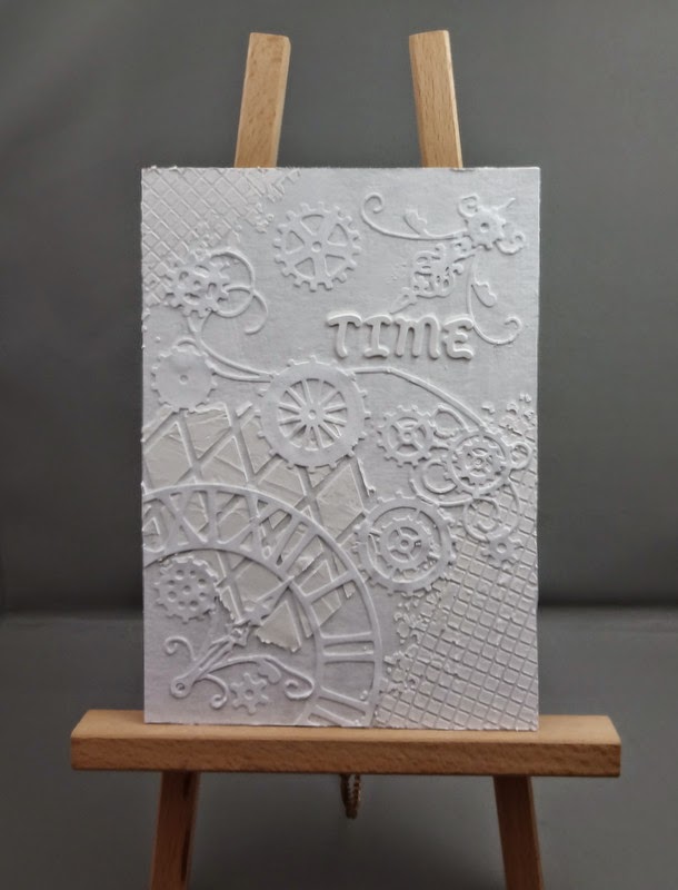
So I started with a piece of greyboard cut to fit a 5 x 7 frame, applied gesso all over it, left to dry. Then I added texture paste through stencils and adhered various die-cuts and some letter stickers, and gesso'ed all over again. At which point it looked like this:
The frame was a plain wooden one, I painted it with Paperartsy fresco paint in chocolate pudding, then added some copper spray mist over the top, but this made it compete with the artwork too much, so I knocked it down a bit with some Paperartsy matte glaze. The final touch was to add some metal corners, from 7 Gypsies I think, coloured with alcohol ink. I also added a few crystals to the gears in the piece.
And there it was done! I am rather pleased with it and will definitely do some others. After all, I have a whole tub of gesso to use up ...... :-)
This one from Misteejay:
http://misteejay.blogspot.co.uk/2014/03/sunshine-good-company.html
And this one from Gabrielle Pollacco, which I found via a video link on you tube:
http://gabriellepollacco.blogspot.ca/2014/01/video-tutorial-steampunk-journal-cover.html
the video is well worth watching, not too bad at a shade over 24 minutes, though I did mute the music after a while :-)
So I started with a piece of greyboard cut to fit a 5 x 7 frame, applied gesso all over it, left to dry. Then I added texture paste through stencils and adhered various die-cuts and some letter stickers, and gesso'ed all over again. At which point it looked like this:
Now for colour..... I used spray mists and alcohol inks and water from a mister to make the colours run nicely. The piece was dried with a heat gun between each colour. Then I applied Treasure Gold in Classic Gold over the raised die-cuts and some TG in Aquamarine in a few areas.The frame was a plain wooden one, I painted it with Paperartsy fresco paint in chocolate pudding, then added some copper spray mist over the top, but this made it compete with the artwork too much, so I knocked it down a bit with some Paperartsy matte glaze. The final touch was to add some metal corners, from 7 Gypsies I think, coloured with alcohol ink. I also added a few crystals to the gears in the piece.
And there it was done! I am rather pleased with it and will definitely do some others. After all, I have a whole tub of gesso to use up ...... :-)
Wednesday, 12 February 2014
Order and Chaos
A while ago, I cleared out my craft room. Literally. I took everything out of the room ... then tried to get it all back in! I gave or threw away a lot of stuff. I found all sorts of things I had forgotten about, including a large number of wooden items I had bought to "do something with". These wooden tea light blocks came, I think from the Craft Barn and are made by Artemio.
I primed them, then painted them gold. Then I applied Paperartsy crackle glaze, left to dry and over-painted with a burgundy acrylic paint. They stayed like that for a while, I knew I wanted to use texture paste, but didn't have it quite straight in my head as to how I wanted to proceed. Then I bought the random circles mask and realised that I could use it on one block, with the gridded squares mask on the other block. And so Order and Chaos came to be ......
I used some Treasure Gold through the stencils once the texture paste had dried, then when that had cured for 24 hours, I used a matt varnish over the whole block - Americana Duraclear Matte varnish, again from the Craft Barn. It is the best varnish I have found so far for a really matte finish, but it does need to be stirred thoroughly so that all the matting agents are well mixed rather than sunk to the bottom of the container!
I put some green sticky-back felt/baize on the base and they were done. They are a little more burgundy than they appear in the photo, not quite so red :-) One wooden item down, 999 to go......
I primed them, then painted them gold. Then I applied Paperartsy crackle glaze, left to dry and over-painted with a burgundy acrylic paint. They stayed like that for a while, I knew I wanted to use texture paste, but didn't have it quite straight in my head as to how I wanted to proceed. Then I bought the random circles mask and realised that I could use it on one block, with the gridded squares mask on the other block. And so Order and Chaos came to be ......
I used some Treasure Gold through the stencils once the texture paste had dried, then when that had cured for 24 hours, I used a matt varnish over the whole block - Americana Duraclear Matte varnish, again from the Craft Barn. It is the best varnish I have found so far for a really matte finish, but it does need to be stirred thoroughly so that all the matting agents are well mixed rather than sunk to the bottom of the container!
I put some green sticky-back felt/baize on the base and they were done. They are a little more burgundy than they appear in the photo, not quite so red :-) One wooden item down, 999 to go......
Monday, 9 September 2013
Calorie free chocolate tag
I made this tag to put on a birthday card, but decided to leave it just as a tag, so it could be used as a bookmark :-)
I distress-inked a manilla tag using Antique Linen, Tea Dye and Vintage Photo, then used Tea Dye to stamp the background in crackle and bubbles designs, both from Indigo Blu. Then I stamped the Paperartsy chocolate quote. At that point I didn't really have a plan, but I decided it was time to have another go with texture paste because I have recently bought several masks (part of my birthday spending!).
I used a Crafters Workshop gridded square mask and applied the paste, left it to dry. I had thought of inking over the top, but I remembered the Treasure Gold metallic wax, also bought recently, the color is Onyxite. It looks just like chocolate!
For the 'wrapper', I used a piece of embossed metal from my bits and pieces box and folded it around the base. Then I backed the whole thing with a blank tag, to hide the metal edges and to make it more substantial, and finished with some ribbon.
I am definitely going to make some more of this calorie-free chocolate!
Sunday, 14 July 2013
"Destination & Journey" box framed picture
Inspiration is a funny thing ....... a few weeks ago I had decided that I really should use the texture paste I had bought after Sy had shown me how to use it, so I applied some through a mask to a piece of linen-effect card. I didn't know what to do next, so left it lying around on my desk.
Then last Friday evening, it happened that I was doing some blog hopping, with a glass of cider to hand LOL, and was reading the Tando and Craft Barn blogs - both of them had projects involving mists. So I (or was it the cider?) decided that what that texture-pasted card really needed was some misting! Off I ran into my craft room and applied some Cosmic Shimmer mist in Patina, blotted with kitchen roll then swiped over the top with a chalk ink pad. I found the tag, which I made, oh, at least a year ago, but had never found a use for, in my "useful bits" box, together with the embossed piece of cardstock and the die-cut squiggle borders. Then I spent some time arranging and re-arranging the elements before having the sense to let the misted piece dry overnight :-)
Saturday was spent shopping, siesta-ing, pizza making .... so I didn't get back to it, though ideas were beginning to wander around in my head - I even fell asleep thinking about it! So today, I set about trying to bring all those random thoughts together. It was going quite smoothly until I decided that I needed to put a key on, luckily I had only stuck the textured piece to its backing board and not attached the whole thing to the picture! So I cropadile'd a hole for a brad, then had to find some black chain and jumprings to assemble the dangly bit for the key to hang from ...... After that it was just a matter of die-cutting the piece of embossed card for the side panels, attaching the crystal swirls and the die-cut squiggles, then mounting the tag on foam tape over the top. I did have to swear a bit as I attached the silver mandala (originally a piece of Primark jewellery!), as it refused to stick and I had to Glossy Accent it to within an inch of its life!
I have photographed it without the glass in front, here are some close ups:
The frame is from Ikea, I think it is called Ribba and it comes in various sizes - I like it because it stands on its flat base so it doesn't need hanging on a wall. I am very pleased with this, it will be going to a shelf on the landing, but for now it is stood on the dining room table so I can look at it!
I should also say ....... not all my crafting is cider-assisted....... :-)
Monday, 4 February 2013
Texture paste masterboard
The first full weekend in any month is always my craft weekend, consisting of a craft day at my house on the Saturday and going off to the Cardinal Colours crop on the Sunday. Sy arrives early-ish Saturday morning and we fill the dining table with stuff, then get going!
Sy makes me *do things* ...... this time she brought some texture paste, which I have never used before. I also have some masks, bought two years ago at Ally Pally and never used. So I scraped some texture paste over a mask in various places on a 12" sheet of card, which I had smooshed over with distress inks in shades of blue. The idea of a masterboard is that you then cut it up and use it for ... whatever .... cards, or scrapbooking or ATC's......
I sprayed through another mask with a golden-ish shimmer spray, it doesn't show up very well in the photo but it is there! I stamped in various blues in all the spaces, then when the texture paste was dry, I repositioned the mask over it, and rubbed over with a gold ink pad.
A couple of close ups:
I do like the way this has turned out, though I am not sure how I will use it yet. Although, the Scrapology challenge this month is T for texture paste......
And, I liked it so much that we had to go out shopping in the afternoon so I could get a tub of my own :-)
Subscribe to:
Posts (Atom)