A blog for cooking and crafts

Monday, 3 October 2016

Blogtober 2

Today's Christmas cards are made with a 6" paper pad from Craft Creations, there is no direct link to the product, but the code is PK727.  The design is the same throughout - various Christmassy words in white on a background of several different colours.  I have separated out three colourways for this week - today is blue!


The stamp is an old Tinchies one, I have just simply stamped and matted onto the word paper background which is also matted onto the card blank.  I did make three, but apparently failed to photograph the third one, it's a lighter blue!  The larger panels were cut by hand, the smaller ones were die-cut.  I didn't add a sentiment, since the whole background is already covered with them :-)
A nice, simple and relatively fast card to make - I made ten over the weekend!

Saturday, 1 October 2016

Blogtober is here!

Welcome to my first Blogtober post :-)  I have decided to go for blogging three times a week, every Monday, Wednesday and Friday - plus this first post!  For full Blogtober details, hop over to Karmacraft to see how you can take part in this challenge.
I'm going for a theme for the whole month, it's Christmas, Christmas, Christmas all the way!  This first post is my Beat the Christmas Rush for September.


I have gone for a Scandi theme, with kraft red and white.  White stamping and embossing on kraft, with a red mat and kraft card blank.  The stamp is from Indigo Blu, bought ages ago but never really used, and the sentiment is brand new, from Visible Image.
I really like the way this has come out, there will definitely be some more Scandi-themed cards during the month!

Friday, 23 September 2016

Out of the Drawer - Art Deco Thank You card - and Blogtober announcement

I love both Arts Nouveau and Deco, so when Spellbinders brought out some very Deco dies, I had to have them .....  But they were bigger than I had thought and it put me off a bit, so in the drawer they went :-)
Fast forward to a sudden need for a thank you card .... the recipient had mentioned that she liked both styles too, so these dies came to mind immediately.  I didn't use the biggest one of the set, but cut the smaller mat, frame, and deco flower in a combination of white and gold.


The sentiment is stamped and embossed.  With hindsight, I think I could have rounded the four corners of the card blank for a better look - but I had to get it in the post :-)

Now ... fanfare ... Blogtober 2016 is imminent!  Last year, the idea was to blog every day for the whole of October.  I managed it, but it was hard and I already know that the combination of work, committing to exercising more (I now walk to work three times a week), and the rest of Real Life are going to make it even more difficult.  So Sy over at KarmaCraft has come up with a cunning plan for this year.  Set your own goal for Blogtober!  Every day, three times a week, once a week, whatever you want to do, but the challenge is to stick to your goal :-)  To register your interest, hop over to KarmaCraft and link up as per Sy's post.  I haven't quite decided how many times a week for me yet, but I do know it's going to be very, very Christmassy......

Sunday, 21 August 2016

Flower Wreath cards - three colourways

I have had this stamp (Stamps by Chloe) for a while and decided to stamp/emboss it in silver, several times, to try out different colourways. 

I die-cut the coloured images into circles and cut out an inner circle.  Having matched each colourway to cardstock, I die-cut a stitched circle mat (Crealies) and another circle just slightly larger than the aperture from a die-cut trellis panel (Tonic Studios), for the inner circle aperture.  I also cut butterflies (Frantic Stamper) and a swallowtail pennant (Spellbinders), plus some plain white sentiment banners.

I had found these shaped card blanks in my stash and decided to use them up, but I like the way a circular topper looks on them, so I may have to buy some more!

Shades of aqua:


Contrast of blue and yellow:


Shades of purple:


I am definitely going to do some more of these, I think I will make the sentiment banners larger next time and also it would probably be easier to have an embossed central circle, rather than trying to stick down a fiddly die-cut LOL. 

Thursday, 11 August 2016

Out of the Drawer: Monochrome letter rack

In 2014, I went to the Merly Impressions retreat and had a wonderful time :-)  This letter rack was one of the included kits - I didn't start it at the retreat, but brought it home 'to do later'.

Two years later...... a lady who had been to the 2016 retreat, posted her beautiful completed letter rack on Facebook and I thought - I really must do mine!  I made a good start, then family bereavement and the resulting issues put a stop to any other thoughts for a while.

Last weekend was my craft weekend, so I decided to make finishing this my priority.  The papers are all Kaisercraft, though I am not sure from which ranges now (having lost the original kit instructions!).  The back surfaces of the dividers, the inside sides and the back of the rack are painted with black acrylic and then sealed with a matte varnish.  The handles are from Tonic Studios, they are brads, so were easy to attach to the greyboard drawers and I really love the effect.


Now all I have to do, is finish the other BTP products I bought in 2014...... plus the one I have just bought ...... before the retreat next year :-)

Thursday, 14 July 2016

Buy it - Try it: SU Moroccan nights stamp set

Something a little more current than the last post - in fact I think this might be either a first, or part of a very exclusive club LOL.  I have actually tried out a new stamp within ten minutes of its arrival!!!!
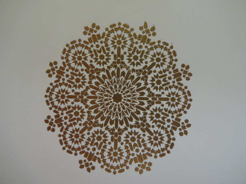
The stamp set in question is the Moroccan Nights from the latest Stampin Up catalogue.  I did hesitate over buying it, as I am not sure what I am going to do with the lantern images, but the medallion just called to me :-)
I knew I wanted to try it with gilding flakes when I first set eyes on it, so that's what I tried first.  I got an Indigo Blu starter kit some time ago, have used it a couple of times, and it's high up on my "I really must use that more often" list.  So here are Autumn Blaze, Morris Dance (both from IB starter kit) and Mulled Wine flakes from Cosmic Shimmer.  I did have a go with Chocolate Box (IB), but I stamped too enthusiastically and there was too much glue to give a good result, or even one worth photographing LOL.  I'm also including a picture of some essential pieces of kit for using gilding flakes .... First, anti static tumble dryer sheets as the stuff floats everywhere and clings everywhere it lands!  Second, a mini dustpan and brush for clearing it all up.  I got mine from the Glitter Pot, but there are a few different brands around.  Also really good for clearing embossing powder off your desk LOL.


Next up was to use embossing powder.  I had also ordered some SU embossing powders, as I wanted to try the new copper and someone had recommended either the silver or the gold, since I couldn't remember I ordered them both!  The silver didn't photograph at all well, I'll try to get a decent pic another time, but it does look fine.  The gold and copper, and indeed the silver, seem to have a matte metallic effect, although they shine, it's in a subdued kind of way :-).  They do look nice and there wasn't any shadowy residue which some brands leave behind.  The last colour to try it with was an old one - Verdigris by Stampendous.  It's a variegated powder and I wasn't sure how it would hold up to such fine detail, but it looks fantastic and is my favourite of all the embossed ones.


So I have had an experimental kind of day, it's been fun :-)

Tuesday, 5 July 2016

Distress Ink Trio

A few weeks ago, I decided to try to make three different cards with the same three DI colours.  Did I write those colours down?  Noooooo!  Can I remember them now, having been both poorly and suffering from an acute attack of Real Life in the meantime?  Noooooo!  I can tell you that there is a red, an orange and a yellow and that I am fairly sure the yellow was Fossilised Amber.  But I'm afraid that's it...... :-(

For the first card, I made a stencil using a scalloped circle punch and blended the three colours through the aperture, then over-stamped in black.  One of the mini butterflies is there to cover up the accidental black smudge, the rest are to balance it LOL.


For the second card, I applied the three colours randomly over a stencil.  This made such a nice background, I didn't want to cover it up too much (always my problem with backgrounds....), so I die cut the sentiment and butterfly, which is only stuck down along the body so the wings are free and finished off with pearls.


For the third card, I embossed some white cardstock in the Bigshot and brushed the three colours over it.  Then I stamped the flower in a mixture of the colours and softly blended over with the yellow (Fossilised Amber!!!).  One flower is stuck flat to the card and the second is raised on foam pads.  The banner sentiment is coloured to match.


Whilst typing, my brain is whispering that the red and orange might be Fired Brick and either Spiced Marmalade or Dried Marigold.  But don't hold me to it :-)